Page 2 of 2

Re: New 2D Thoughts

PostPosted: Wed Dec 07, 2022 4:55 am
by Haiku
Sweet! I love the changes!

Just a few small positioning notes if you don't mind:

https://i.gyazo.com/1ccbe3b243d441319371296676204662.jpg

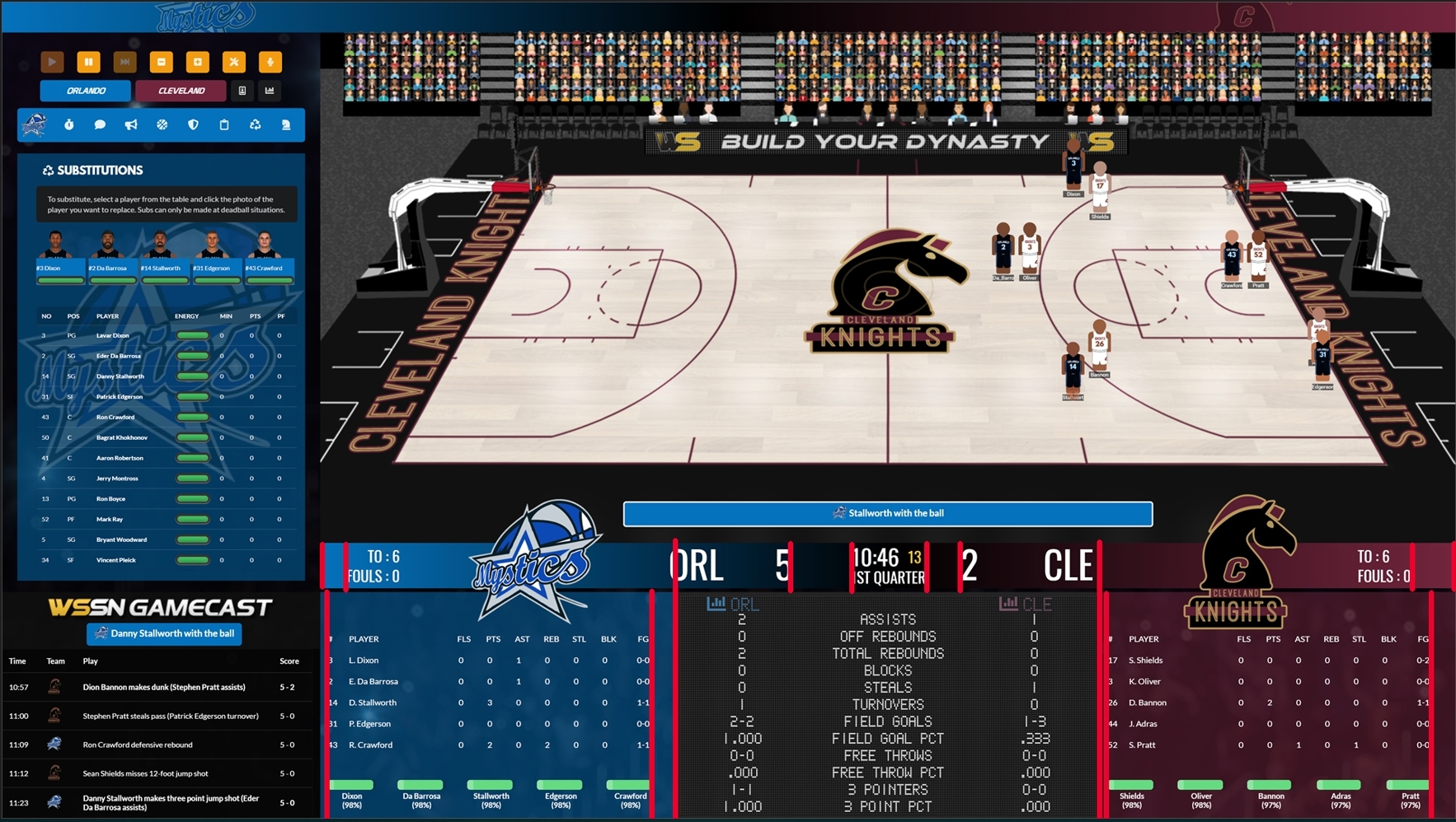
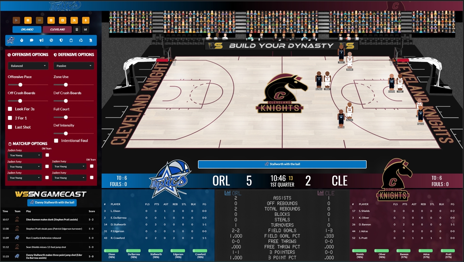
1. The blue bar content with Orlando's logo is not positioned the same as the Cleveland's. Should be moved a bit to the right. For example "5" is closer to the clock than "2" is. There's difference in space at the other end as well.

2. Can you center the team panels content as well? Should be moved a bit to the right as well.

3. ORL / CLE abbreviations within the scoreboard are too cramped to the stats content. If you ask me we don't need these, since it's a common sense which stats correspond to which team plus we already have the team abbreviations where the scores are.

4. Now looking at the substitutions panel content is not quite centered as well, should be moved a bit to the left.

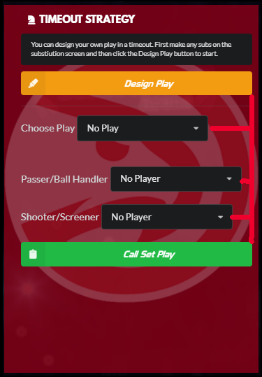
5. Can we have drop down buttons within Timeout Strategy aligned to the right?

https://i.gyazo.com/66d344b16ad5c7dc12d ... a6ceae.png

Re: New 2D Thoughts

PostPosted: Wed Dec 07, 2022 7:38 am
by Haiku
I acknowledge it's probably a long shot, but here's my suggestion about subs panel:

https://i.gyazo.com/7268fb5bef9b418ad0b299060baa3c6c.jpg

The major issue I have with the current layout is team sheet text with players' names is just too small to read on my 23" display.

The idea is to have the player images of all players available and to be able to select them. IDK if this is a difficult functionality to make?

Football Manager has that drag & drop functionality that would be great if it can be introduced in future versions.

edit: Looking at how cramped everything is... I don't like my suggestion either...

Re: New 2D Thoughts

PostPosted: Wed Dec 07, 2022 1:51 pm
by Haiku
I really hope you will reconsider the UI design for future versions. For me the left side of the screen functionality gone to worse from 22.

1. IDK what the new substitution panel brings:
- It's small.
- Has less information
- We can only make a change during stoppage time, so I don't need to see the court when I use it.
- Player stamina indicator does not update in real time.

I don't see any reason why this is better than the functionality of subs window in 22.


2. Strategy options are accessible from 3 different buttons. On 22 I had all strategy tools in front of my eyes. I could see my strategy settings the whole time. Now I have to click on 3 different buttons just to see what options are active. Now do this 100 times per game. This is how often I would do changes. It's a real bummer...

https://i.gyazo.com/6adea941b91079ff4f1 ... db3e69.png

Re: New 2D Thoughts

PostPosted: Wed Dec 07, 2022 4:51 pm
by Haiku
Sorry for spamming.

Regarding strategy settings, how about this?: https://i.gyazo.com/8ea1c5b4cad8e918e02 ... a76d3c.jpg

Actually it's not that bad.

Re: New 2D Thoughts

PostPosted: Fri Dec 09, 2022 9:57 pm
by jlemmen43
Excellent update, in my opinion! I really like how the Players and Stats buttons have been moved up and out of the strategy section. The Team Stats/Highlighted Player box keeps my eyes centered to the action. If I'm playing on a slower speed, I'm able to look to the far left and see the PBP without losing sight of the action. I think the positioning is perfect there for all types of play. The game looks and feels pretty awesome for what it's expected to do. The little hops when they shoot is great. It's one thing to see the changes on the screenshots from the mockups, but a whole other to see it while playing. Great work and thanks for listening to our nitpicks.

Re: New 2D Thoughts

PostPosted: Sat Dec 10, 2022 11:21 am
by markprior22
Love the new layout....thanks Gary!

Re: New 2D Thoughts

PostPosted: Thu Dec 15, 2022 9:47 am
by Haiku
1. Text positioning issues:

https://i.gyazo.com/f9fcc9c24b5f1c03a3f37d83383e5709.jpg

https://i.gyazo.com/a632d6216fdcbcc905d0f14d7112c9e1.jpg

2. Regarding subs panel: Can a larger but condensed font be used instead?
I'm surprised at the lack of feedback on this. It's a big problem for me, because I have trouble reading the player's names and info.
I'm certain there are others with impaired vision who will experience this problem. Please, let's find solution on this!!!

3. Confront ref button being so close to offensive settings is not the best solution. I frequently mis-click on it and receive technical foul.

4. Why did jersey selector got smaller? It was nice to have a proper look at the jersey graphics, yet they're small.

5.Player names on court - what is the point to have them, when I can't read them? I'm playing on 23" display. At what screen are you testing the games?

P.S. I just installed on my 17" laptop. it's a nightmare of small fonts. Team table and PBP are also small...

Re: New 2D Thoughts

PostPosted: Fri Dec 16, 2022 8:57 pm
by Invisible Witness
Just downloaded the demo. The font size is too small for my eyes. I used to complain about it few years ago sadly it remains too small. On seperate note the rim and net are not that visible because of background (court's outline). Maybe moving the hoop little bit forward would help so that the background is the court (bright).
Otherwise the game looks great but for me 2D is bread and butter and squinting my eyes gives me headache