
I enjoy the upgrade to the 2D gameplay, but I'd like to add my 2 cents on it.
I feel like the jerseys need to be bigger. I play on a laptop, so I don't expect the graphics to wow me, and I dunno how much better it is on a bigger screen...but I can barely read the player numbers or names. You basically need to make the # outline the same color as the # or it looks like a mess. The LA Waves Road jerseys are a great example of the messiness. The Utah Blues road jerseys are a great example in the other direction. There's a good amount of dead space in the display (mostly the corners and sides of the court). I think the play by play could be condensed and moved to the top of the court by the crowd. If you pay attention to the PBP, you won't need to see 3 actions ago. You only need to see about 2 actions or so at a time. You could have an extended PBP that comes down with a click too if you wanted to quick look back on some plays. The crowd only matters when Play is hit, so i think covering them when not in play could be advantageous. Also the Area where the Team Stats/Current Player Stat is shown could be modified for size. Free-Throw Percentage could be put next to the 0-1. Nobody needs Free Throw Percentage spelled out on a second line. Blocks and Steals could be fit on the same line too. The Player Picture and Name size is perfect I think. But the specific stat line could be a bit smaller or fit better within. 2 Points 1 Rebound doesn't need to be as big as it is, IMO.
As far as the animations are concerned, It'd be great to see a hoop light up when a bucket is made. Maybe even different colors for different scores (Blue for Dunk, Red for 3Pointer, Yellow for Layup, Green for regular shot). Maybe even a light up under the player who takes the shot. Also, fast breaks would be great to see a clear separation between those involved in the break and those still near the previous basket.
The new court setup looks pretty damn sweet. And I like the Team menus. Also the ability to see the player card during the game.
Keep up the good work and I know the first rendition of the visual upgrade won't be perfect, but those are my suggestions to make it a better experience.
New 2D Thoughts
18 posts
• Page 1 of 2 • 1, 2
New 2D Thoughts
![]() by jlemmen43 » Wed Nov 30, 2022 2:57 pm
by jlemmen43 » Wed Nov 30, 2022 2:57 pm
-

jlemmen43 - Senior Member
- Posts: 528
- Joined: Wed May 02, 2007 8:01 pm
- Location: Boise, ID
Re: New 2D Thoughts
![]() by Gary Gorski » Wed Nov 30, 2022 4:41 pm
by Gary Gorski » Wed Nov 30, 2022 4:41 pm
I appreciate the feedback and over time as more and more people provide feedback it will continue to evolve.
-

Gary Gorski - WS Development
- Posts: 8946
- Joined: Thu Apr 27, 2006 3:56 pm
Re: New 2D Thoughts
![]() by Haiku » Wed Nov 30, 2022 6:54 pm
by Haiku » Wed Nov 30, 2022 6:54 pm
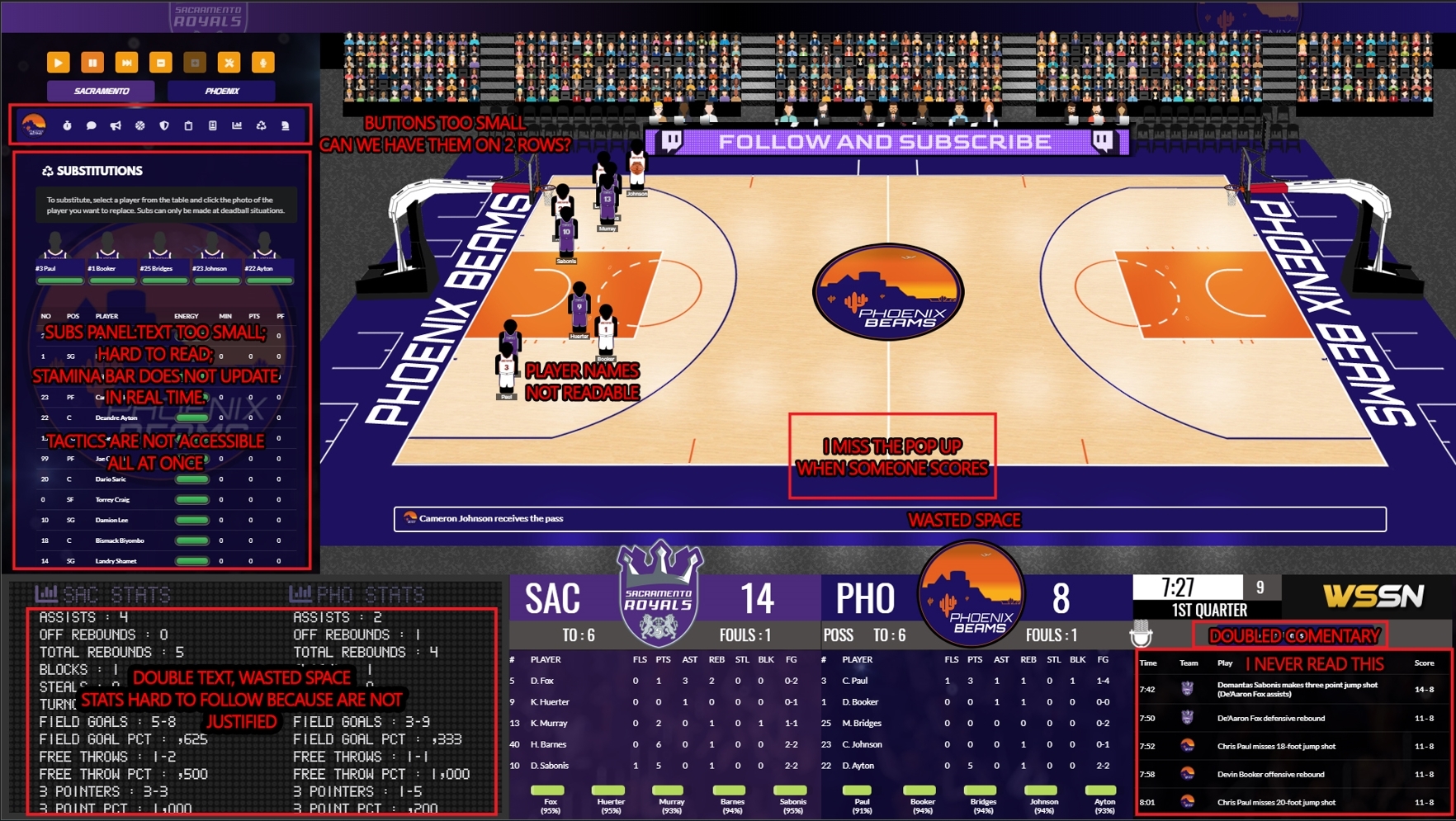
Let me put my 2 cents in. I love the game! I love the new 2D view, however the Interface functionality has gone backwards.
Here's what I don't like in particular:
1. Strategy settings are not accessible all the time and are split behind two buttons. More clicks and less functionality compared to previous versions.
2. Buttons are too small. It's very easy to hit "confront ref" by mistake while trying to access the offensive options. Can we have these apart on 2 rows with double size buttons?
3. I don't like the subs panel. Text is too small. it's hard to navigate and easy to pick the wrong sub. Subs screen from previous version wasn't great, but certainly had better functionality.
4. The score board is nice feature, but for me it doesn't add much. First I have to pause the game to properly look at team stats, because I like playing at max speed and it keeps switching between team and player stats way too often.
On previous version we had team stats available all the time. There's so much wasted space because team stats description is doubled for both teams, so unnecessary. I would justify the stat numbers for easier read. Also text is too big compared to other panels. I think scoreboard takes too much space.
5. Game log - Personally I never read this. I would hide it behind a button like the detailed team and player stats and use the space for increasing the sidebar space on the left, so that we can fit all strategy settings at one place and also make functional subs panel.
6. Unnecessary doubled commentary. Seriously does anybody read the commentary? It feels like watching sports with subtitles.
7. Player names on the court (below jerseys) are unreadable on my 23" display.
8. I miss the pop up info box from previous version that appears when someone scores. It was just there on the court and gives valuable information about who did what. Now I need to move my eyes off the court all the way to the bottom left to see what happened. Playing on max speed it's very often that I can't figure out if the team has scored or there was a rebound. That missing pop up info box would have fixed that.
9. Energy percentage goes off screen for players with long names, for example Gilgeous-Alexander. I would rather not have this information altogether, because it's not realistic. How can remaining human stamina be measured with exact number from 1-100!?
Attached image:
https://i.gyazo.com/14720fe35b0023e58516de742ca6af51.jpg
- Haiku
- Junior Member
- Posts: 39
- Joined: Mon Aug 01, 2022 8:10 am
Re: New 2D Thoughts
![]() by Gary Gorski » Fri Dec 02, 2022 3:57 pm
by Gary Gorski » Fri Dec 02, 2022 3:57 pm
Again I appreciate the input although some of your thoughts here are contradictory.
If you want the buttons to be larger and take up two rows you are going to be increasing the vertical space used by quite a bit and then you are saying that not having the strategy options all together is a problem as is the subs being too small but if you use more space for the buttons then those areas are only going to get smaller.
You said you don't like that the popup box was taken out in favor of putting that information on the scoreboard display in the lower left because you have to move your eyes down there but there is running PBP commentary right under the court as well as the space in the lower right that is a recap of the past couple of possessions as well as the "doubled commentary" as you call it of the current action but what that does is it means that literally anywhere you look at the bottom of the screen you are being told what is happening so that if you do happen to look away from the main court area you still know what is going on.
As for the stamina - how would you propose knowing when a player is tired if they do not have some kind of energy meter to show you? The percentage there is exactly the amount the bar above it is down from its 100% starting point as a courtesy to players who do not want to estimate how low the visual representation is.
Also some of your comments are totally valid for someone who is playing on max speed but that is not really how its designed to be played nor is it how most people are going to play it so when I consider complaints like yours due to a specific way of playing any changes really have to come from the standpoint of how can I improve this for this player but not make things worse for all the other players. For example maybe at max speed the scoreboard area should never popup the player info and only stay on team stats. For someone who is playing on normal speed that scoreboard area is great because most of the time they are looking at the team stats and then they get a popup that with some different info, they get a nice big photo of the player and get a quick stat update on that player while the action is setting up for the next sequence of play. Also just because you do not read an area or don't use something does not mean its not useful to other players.
I also think that its easier to identify players if they are either game generated or if you edit the model skin tone for the default players so that everyone is not the default black/dk grey model
I chose to separate the strategy options into their own window this time so that everything was not so cramped and I didn't feel that they were things that need to be constantly changed so having to click on a button to bring up the window and make a change was not going to be an event that happened to the point where it would be an annoyance. The sub area - I am all ears for making it better but my assumption is that everyone wants to be able to see the full list of their players, their current energy and at least needs to know how many fouls a player has to sub them in so I am not really sure how to change that area because I am showing literally the bare minimum of info there.
The spacing and sizing of items is very challenging - its easy to say make things bigger but how? You can't make the court and players smaller because you say its already difficult to read the numbers and text under the player. You can't make them larger because that would mean even less space for the other items. You can't just shrink the court width - that would make the court look unnatural. What does taking out the double text of the team stats get you? You're not going to fit that in the area between where the team box would extend to the bottom and the main on court players/score area unless you make the text much smaller there but even if you did that what do you do with the scoreboard that displays the player photo and stats after a play? That can't be made to fit in a tiny space not especially with players who have long names. Also things like making text bigger - ok text can be bigger but that makes it wider too which means other things get spread out horizontally and vertically which means there has to be the space for those things and when you are talking about things that use player names you have to account for players who have a last name like Gilgeous-Alexander and not just fitting Fox into an area.
I am not saying nothing can or will change or evolve here but I also don't feel there is wasted space or that I can make things larger just like that. The space is what it is - we can take all the information off the screen and just have the court and then have to have you go to other screens to do actions like you would playing 2K or something like that but I think people would much rather prefer to have everything accessible on one screen for this style of game.
If you or the OP or anyone else wants to like mock up a full screen showing how to lay things out and position them to solve some of these issues I certainly would be happy to look at it and see what the community thinks of certain things. Even if they are not able to be changed this version I could use it as a redesign for the next one or even take elements from it if some of the ideas are better than others. I don't want to sound like I am being critical of feedback because I do appreciate it - I'm just saying I don't really know what could possibly be done about some of these items without either sacrificing some/most/all of the things on the screen. Just because I can't visualize it doesn't mean that nobody can though so if someone does have a better way of laying things out I would be glad to look.
-
Gary Gorski - WS Development
- Posts: 8946
- Joined: Thu Apr 27, 2006 3:56 pm
Re: New 2D Thoughts
![]() by Haiku » Fri Dec 02, 2022 8:17 pm
by Haiku » Fri Dec 02, 2022 8:17 pm
Gary, my English is not great. Sometimes it is difficult to express myself. I was just trying to point out the things I don't like within the 2D game view.
I said nothing about the things I like, because there are so many. Of course everything I said is subjective. It is from my perspective as a player.
I can help you out with an idea about how to plan the layout of the 2D screen.
If I was the game developer, I would remove the game log from the screen. It is still useful, but certainly I don't need it in front of my eyes the whole time. Hence why I would keep it accessible from within a button in the top left corner.
Look how that can change the whole screen and to address most of the issues I pointed out in my previous post:
https://i.gyazo.com/d8598b878211a4b41c299d8b7b58066a.jpg
1. I just moved the scoreboard and the clock in the center. The most important information sits central to the court and is so much better placed.
2. There's no double text for team stats. All team stats are aligned and placed under the score for each team. So much easier for the eye.
3. Buttons are bigger!
4. There's enough space to fit all strategy settings in one place.
5. There's enough space to expand the subs panel and to make it more functional. If you can make the green energy bars within subs panel to update in real time that would be great.
6. It may not look obvious, but team panels at the bottom are also bigger.
7. I would increase the font of the names under the jersey. If it does not fit I'll remove it altogether. There are team numbers on the jersey anyway.
8. I think jersey icons on the court need to be a bit bigger. Not 100% sure though.
9. I would definitely remove the % for energy. Football Manager had it for years and removed it for good. It is just not realistic for me as a head coach to have this information. After all players are not robots.
The energy bars are just enough to give us a good indication about player's stamina. There's no need for us to know at what percentage the green bar is, in fact we should not know that.
10. Commentary is there as well, but the box is smaller and text is centered. I would remove team logo and increase text size, because it is a bit small.
11. There are a few ideas I posted in the First Access section regarding the scoreboard design, which would look great if being implemented.
Of course player picture and text size should be adjusted so that Gilgeous-Alexander can fit.
All I pointed out is from my perspective. I very much respect if you don't agree with any of that.
Last edited by Haiku on Mon Dec 05, 2022 8:28 pm, edited 4 times in total.
- Haiku
- Junior Member
- Posts: 39
- Joined: Mon Aug 01, 2022 8:10 am
Re: New 2D Thoughts
![]() by jlemmen43 » Fri Dec 02, 2022 10:09 pm
by jlemmen43 » Fri Dec 02, 2022 10:09 pm
I really like Haiku's reshuffling of the "zones" and the consolidation of the Team Stats text. I can't really speak to the In-game options (subs,strategy,yell at refs) because I just watch the games.
I also agree with the moving the play by play to the top, by the crowd. I think impeding some of the view of the crowd with a PBP box would not take away anything from that visual aspect. The crowd looks just as good as a 2K game, but how often does any person notice that while watching or coaching a game?
As far as making the court and players bigger, I don't have a solution to that. I wish I did. I just hope that someone can figure out a way. I see all the space between the hoop structure and the crowd as wasted, but I don't exactly know how to better utilize that weird triangle area. That's the obvious pitfall about changing the perspective.
I'll keep trying to think of stuff and try to make a visual representation like Haiku did.
Also...if you were someday able to link the Player Card jersey with the On Court Jerseys, was there any ideas on how to make use of that in other parts of the game? The modded jerseys look really good, but a lot of detail never is seen on the court because of the scaling down. It'd be cool if we could see the bigger sized On-Court Jerseys in more than just the "Select Game Jersey" screen. Maybe in the Media reports??
-
jlemmen43 - Senior Member
- Posts: 528
- Joined: Wed May 02, 2007 8:01 pm
- Location: Boise, ID
Re: New 2D Thoughts
![]() by jlemmen43 » Sat Dec 03, 2022 3:27 pm
by jlemmen43 » Sat Dec 03, 2022 3:27 pm
Gary, what about two camera modes...zoomed and regular ? Then you can have the normal courts with all the fixings, but if you just wanna focus on the players, then you could see them in greater definition.
-
jlemmen43 - Senior Member
- Posts: 528
- Joined: Wed May 02, 2007 8:01 pm
- Location: Boise, ID
Re: New 2D Thoughts
![]() by Gary Gorski » Tue Dec 06, 2022 1:11 pm
by Gary Gorski » Tue Dec 06, 2022 1:11 pm
I appreciate the continued feedback - the "zoomed" view thing is an interesting idea but would require things being resized and I don't know how that would hold up graphics wise and the screen would have to be further redesigned for that.
I also appreciate the mocked up design. I'm not partial to everything with it but I may experiment with some of the ideas there.
I also appreciate the mocked up design. I'm not partial to everything with it but I may experiment with some of the ideas there.
-
Gary Gorski - WS Development
- Posts: 8946
- Joined: Thu Apr 27, 2006 3:56 pm
Re: New 2D Thoughts
![]() by Gary Gorski » Tue Dec 06, 2022 10:28 pm
by Gary Gorski » Tue Dec 06, 2022 10:28 pm
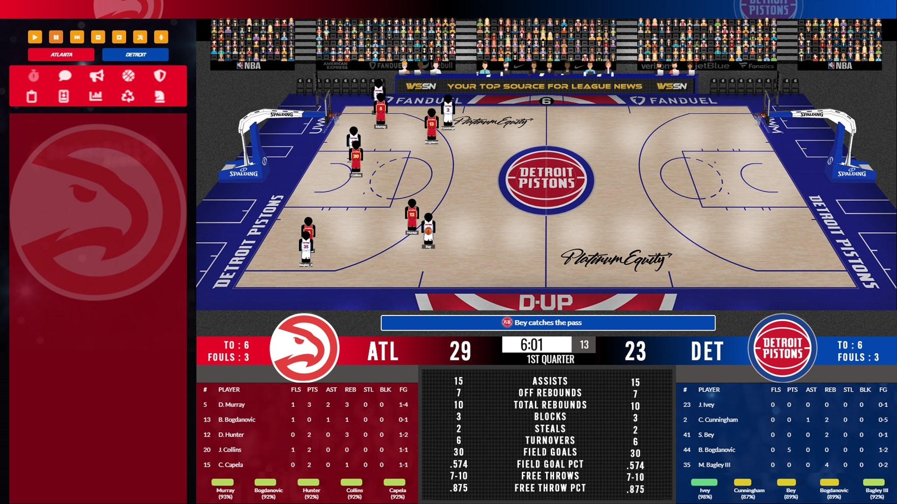
I spent the entire day here reworking the concept of the screen based on the feedback provided. This will be available in the first upcoming update to the game
https://www.draftdaysports.com/download ... 2dgame.jpg
To summarize the changes I have moved the buttons to access the ratings and the game stats up next to the buttons to switch back and forth teams on the sides - doing this allowed for the buttons on the team specific menu to not only be larger but then truly all relate to that specific team.
I have centered the team stats, removed the double labeling of them, centered the pbp text above that area and widened the team boxes in that area as well to be able to make the energy more expansive for longer player names and made the text a little smaller on the player popup.
I also relocated the gamecast type recap to the lower left corner.
I do not want to remove that gamecast output because I do think it is useful to some people and can be useful even if you don't think it is. For example if there is a steal the PBP might tell you who made the steal and such but the gamecast also tells you who made the turnover. The same with a basket - on the gamecast you get the assisting player as well. I hope this will make the game experience even better or at the bare minimum you at least see that I will take feedback and try to make changes based on it where I can.
-
Gary Gorski - WS Development
- Posts: 8946
- Joined: Thu Apr 27, 2006 3:56 pm
Re: New 2D Thoughts
![]() by jlemmen43 » Wed Dec 07, 2022 12:36 am
by jlemmen43 » Wed Dec 07, 2022 12:36 am
I like it! Moving the game cast under the team options/strategy and consolidating the team stats are big improvements to the design. Small things but they make a big difference. Thank you for working hard to improve this...or did you just make your elves do it?? Hehe;)
I understand the potential issues with a zoomed mode. I'm sure you'll get to test and develop many things for the 24 iterations. I think for a first year of advancing beyond jersey boxes, it looks and operates pretty well. I'll be playing the crap out of the college when it comes out.
I understand the potential issues with a zoomed mode. I'm sure you'll get to test and develop many things for the 24 iterations. I think for a first year of advancing beyond jersey boxes, it looks and operates pretty well. I'll be playing the crap out of the college when it comes out.
-
jlemmen43 - Senior Member
- Posts: 528
- Joined: Wed May 02, 2007 8:01 pm
- Location: Boise, ID
18 posts
• Page 1 of 2 • 1, 2
Return to DDS: Pro Basketball 2023 General Discussion
Who is online
Users browsing this forum: No registered users and 0 guests